iCrea
Frontend Developer Trainee
My first job, and I went all in on the animations
My First Job
This was 2017 and I was a trainee at iCrea, a creative agency with offices in Venezuela and Colombia. They wanted a website that felt energetic, stood out, and worked on every device. I was new, I was excited, and they gave me room to push things further than a trainee usually gets to. So I did.
The Hero Section
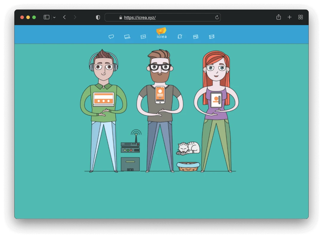
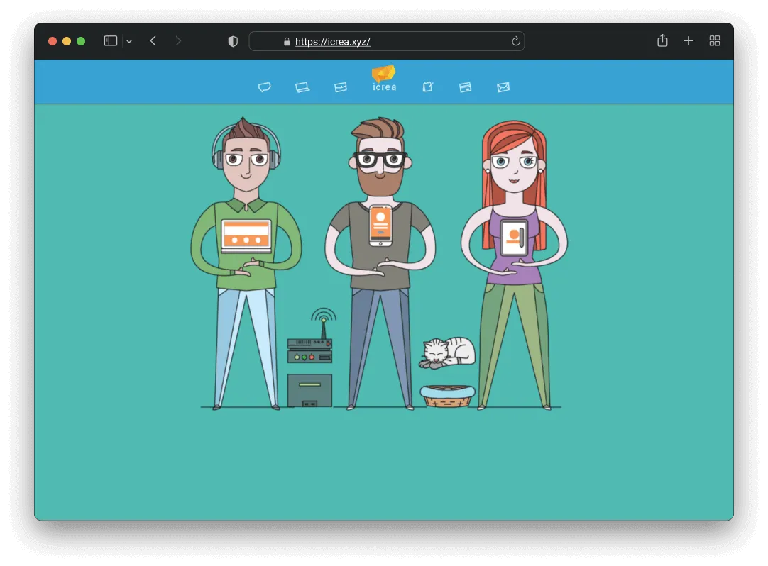
The hero has six independently animated elements that all play together: three characters holding devices (a laptop, a phone, a tablet), screen overlays for each device, a server rack, and a cat popping out of a basket. Each one runs on its own timing. The phone floats at 2.5 seconds, the laptop at 3, the tablet at 3.5, and the cat at 7. The screen overlays have a slight delay from their devices, so the screens feel like they’re lagging behind the hardware. That small offset is what makes the whole thing feel physical instead of flat.
I went through several rounds of tuning on this. Getting six things to move together without looking robotic or random took more iteration than I expected, but the end result was a hero that felt choreographed.
41 Loading Screen Easter Eggs
While the page loads, visitors see rotating quotes that change every two seconds with a fade transition. The team and I sat down and came up with 41 of them together. Some are dev jokes (“sudo rm -rf /”, “Cargando pantalla de carga…”), some are pop culture (“The cake is a lie!!”, “Wubba lubba dub-dub”, “Invocando a shen long”), and some are just absurd (“Peinando al gato…”, “Paseando a la planta…”).
That session says a lot about the vibe at iCrea. You had designers, developers, and everyone else throwing in ideas from completely different worlds, and all of it made it in. For a creative agency, the loading screen is the first impression. We gave it 41 different personalities.
Responsive Across 13 Breakpoints
This is probably the part I’m most proud of from a persistence standpoint. The hero animations needed to work across 13 different media query breakpoints, and I handled portrait and landscape orientations separately because a phone in landscape has completely different available space than the same phone upright.
I didn’t simplify the animations on smaller screens. I repositioned every single element per breakpoint so they’d feel intentional at every size. It was tedious work, but when you open the site on any device and the hero just works, that’s why.
Two Countries, One Site
iCrea had offices in Venezuela and Colombia, and the site needed to serve both. I built a geolocation system that detects the visitor’s country and adapts the content. If you’re visiting from Colombia, the contact info switches to the Bogota address and phone number, the Google Maps pin moves to the Bogota office, the iPago section hides because it was Venezuela-only, and the quotation tool redirects to a contact form instead.
If you’re in Venezuela, you get the full site with the Merida address, the local map pin, and access to everything. One codebase, two completely different experiences depending on where you are.
Dynamic Browser Theming
I added a feature where the site reads the hero section’s background color and updates the browser’s theme color to match. On mobile, the address bar and browser chrome change color along with the animated gradient. Small detail, but it made the site feel like it extended beyond its own borders.
Team Member Animations
Each team member on the site has two images: a hand-drawn avatar and a real photo. On hover, a CSS rotation transition flips between them. I added several team members to this system myself, including the cat mascot Cosmo. Each one has a playful bio underneath with inside jokes about the team.
The Scroll System
Every section on the page uses a scroll-triggered animation system I set up with jQuery Waypoints. Each element gets configured with what animation to play and how long to delay it, and a single reusable function handles all of them. When an element enters the viewport, it animates in. One setup, works across the entire page.
Performance
I did a full image optimization pass across the entire site. Over 130 images compressed, most cut by 50-75%. Team photos went from around 240KB each down to about 48KB. Portfolio thumbnails dropped by 60% or more. The site also uses server-side gzip compression on every page.
I also migrated every link on the site from HTTP to HTTPS and added alt attributes to images that were missing them. For 2017, accessibility wasn’t something every trainee was thinking about, but it felt like the right thing to do.
Technical Stack
Built with what made sense at the time: jQuery for animation orchestration and AJAX, Bootstrap 3 for the responsive grid, PHP includes for reusable components like the navbar, footer, and animation modules, Waypoints for scroll-triggered animations, Isotope for the portfolio gallery filtering across six categories, and custom CSS keyframe animations for the hero choreography.
Looking Back
This project is special to me. It was my first real job, and I could have done less and it would have been fine. But I learned here that doing more than what’s asked, 41 loading quotes instead of one, 13 breakpoints instead of 3, a geolocation system that adapts the whole site per country, that’s what makes the work memorable. The team gave me space to experiment, and I made sure to use every bit of it.
Working on something similar?
I'd love to hear what you're building. For me, the best projects start with a good conversation, so feel free to reach out.
Let's Talk