Interactive Valley
Frontend Consultant
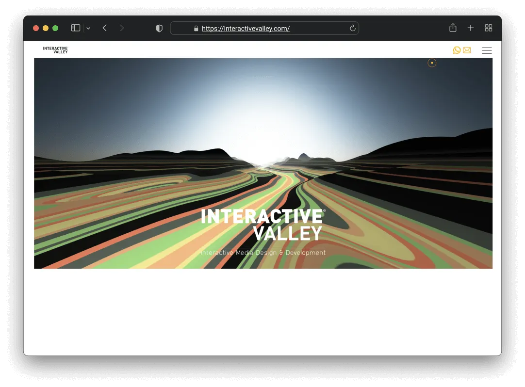
A 3D experience that actually runs on mid-range devices

The Challenge
Interactive Valley is a creative agency that lives up to its name. They wanted a website that felt truly interactive and memorable, not just a portfolio showing their work but an experience that demonstrates what they can do. The problem was that ambitious visuals usually mean poor performance, and we needed to figure out how to build something immersive that wouldn’t die on a mid-range phone.
How I Approached It
Picking Three.js for the 3D work
We needed a 3D hero section. Raw WebGL was too low-level for the timeline we had, and Unity was overkill for a website. I considered Babylon.js but the bundle size was larger than what I was comfortable with. I went with Three.js because the ecosystem, documentation, and community meant we could iterate faster. The bundle is slightly bigger than raw WebGL, but the development speed made up for it.
Going procedural instead of pre-made assets
A static 3D scene would have felt lifeless, and pre-made assets would have limited what we could do. I built the terrain procedurally, so the valley is generated algorithmically and can adapt to different viewport sizes and animation states. The code is more complex, definitely. But the dynamic feel was worth it, and I feel like that’s what separated this from a static 3D demo.
Device detection for performance
High-end Macs would run the full 3D experience without a problem. Budget Android phones, not so much. I set up device capability detection so we could serve different experiences. High-end devices get the full scene, and low-end devices get a simplified version with reduced polygons and simpler shaders. It meant more development time building multiple versions, but the site works for everyone, not just people with expensive hardware.
GSAP for scroll-based storytelling
Scroll-based storytelling was central to the design, and CSS scroll-snap felt too rigid for what we wanted. I used GSAP with ScrollTrigger, which gave us fine-grained control over animation timing, scrubbing, and triggers. It added a library dependency, but the level of control justified the weight.
Technical Implementation
- Lazy loading for Three.js scenes
- Device capability detection for progressive enhancement
- Reduced polygon count and simpler shaders on lower-end devices
- Mobile-specific animation adaptations
What I Took From This
The best animation is useless if it crashes the browser. That was pretty much the guiding principle the whole time. Building for the lowest capability first and then enhancing upward kept everyone included, and I was able to deliver something that looked great on every device. Three.js was the right tool because we could iterate quickly. Raw WebGL would have been impressive from a technical standpoint but impractical for the timeline. The most interesting thing for me was that the tightest technical constraints actually pushed the most creative solutions.
Working on something similar?
I'd love to hear what you're building. For me, the best projects start with a good conversation, so feel free to reach out.
Let's Talk