Puppertino
Creator & Maintainer
Having a framework used by over 5,000 developers is pretty cool
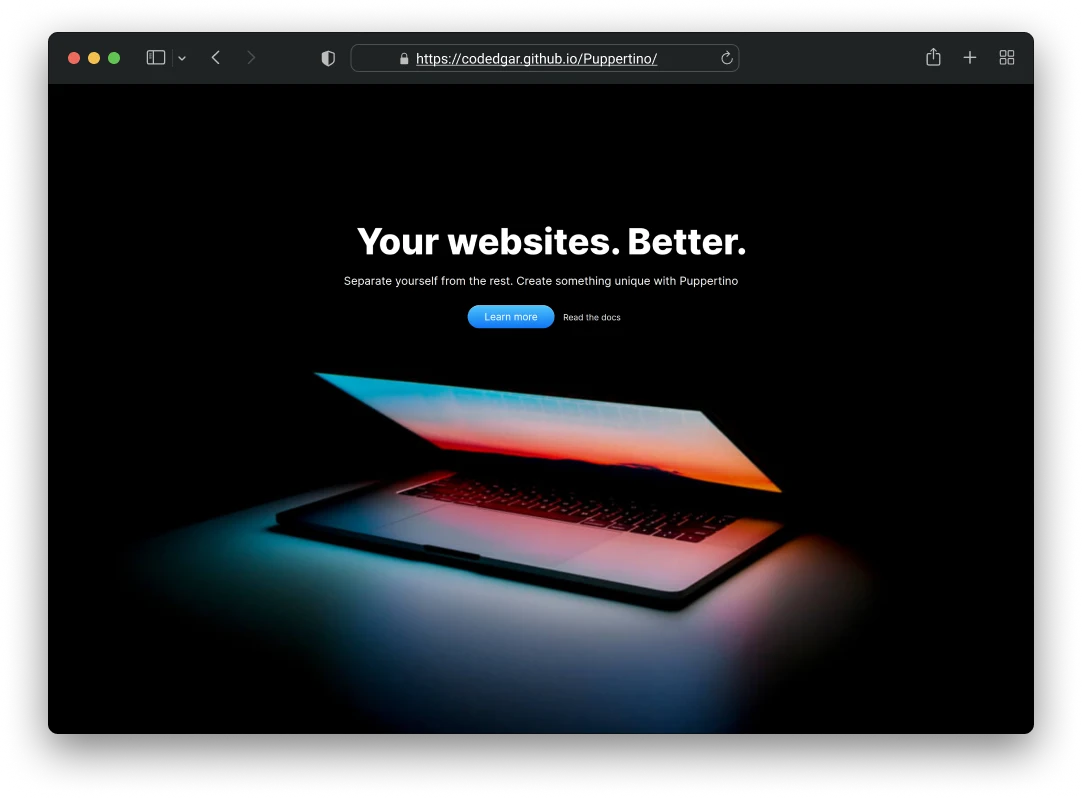
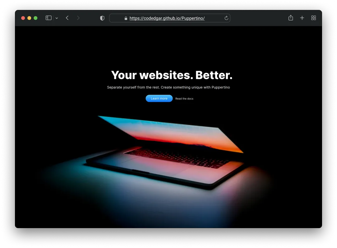
The Problem
When I started Puppertino, there was no CSS framework that looked and felt like Apple’s Human Interface Guidelines for the web. Bootstrap and Tailwind existed, but they had their own visual language. If you wanted macOS-style interfaces, you had to build everything from scratch. I felt like that gap shouldn’t exist, so I built something to fill it.
How I Built It
CSS variables as the foundation
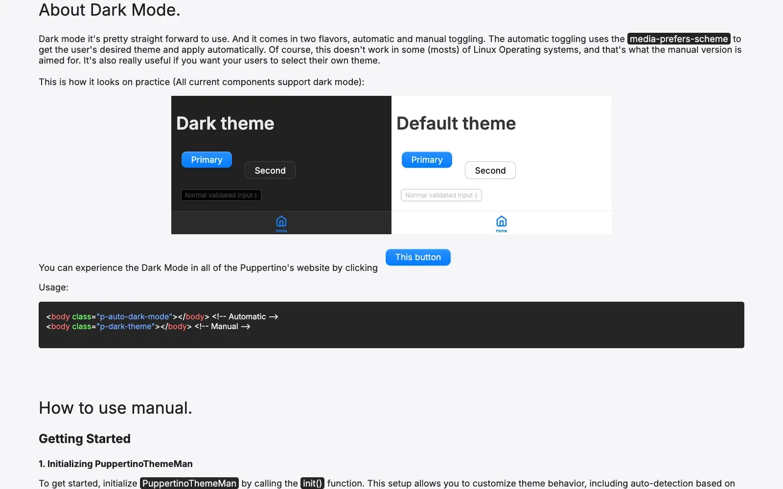
Dark mode was becoming the standard, and I knew Sass variables would require JavaScript just for theme switching. I went with CSS custom properties as the architectural foundation. Every color, spacing, and sizing value is a variable, which means dark mode works natively with no JS required. That meant dropping older browser support, but the audience for a macOS-style framework definitely wasn’t on IE11.
The dark mode system goes deeper than just CSS
The CSS side handles the theming, but I also built a dark mode manager in vanilla JS that does three things most frameworks skip. It detects the OS-level preference through prefers-color-scheme and listens for changes in real time. It lets users override that preference manually, and that choice persists in localStorage. And it syncs across tabs, so if you toggle dark mode in one tab, every other open tab reflects it instantly through the storage event. For me, that kind of detail is what separates a framework from a collection of CSS files.
Being opinionated on purpose
Most frameworks let you customize everything, which sounds great but actually means more decisions for users and inconsistent results. I made Puppertino opinionated. The spacing scale is fixed, the color palette is curated, and components look like macOS by default. Developers who want total flexibility won’t pick Puppertino, and that’s fine. The ones who want macOS styling get it out of the box. That’s the point.
Modular from the start
I wanted developers to ship only what they use. Every component is self-contained with its own CSS variables, no dependencies between files. The package.json exports field lets you import just @codedgar/puppertino/buttons or @codedgar/puppertino/modals instead of pulling in the whole framework. If you only need buttons, you’re shipping around 3KB instead of the full bundle. Each JS module follows the same pattern: the dark mode manager uses a module pattern with private state, the newer components like modals and tabs use ES6 classes with event delegation on the document. No framework dependencies, no build step required.
Writing docs before code
A lot of CSS frameworks have great code but poor docs, so developers end up reading source files instead of building. I wrote documentation before writing the component code. Every component has live examples, copy-paste snippets, and customization notes. It slowed down initial development, but adoption grew because people could actually use the thing without guessing.
I did try rebuilding the docs system once. Search, a different way of putting the pages together, all of it. It never felt better than what it replaced, so I took it back out and the docs stayed the way they were.
The Scope
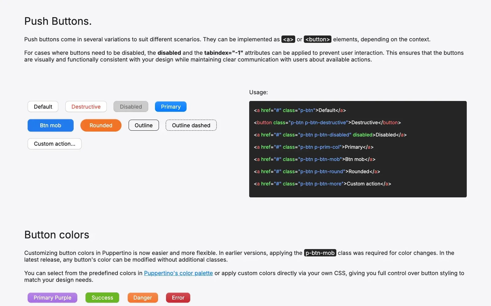
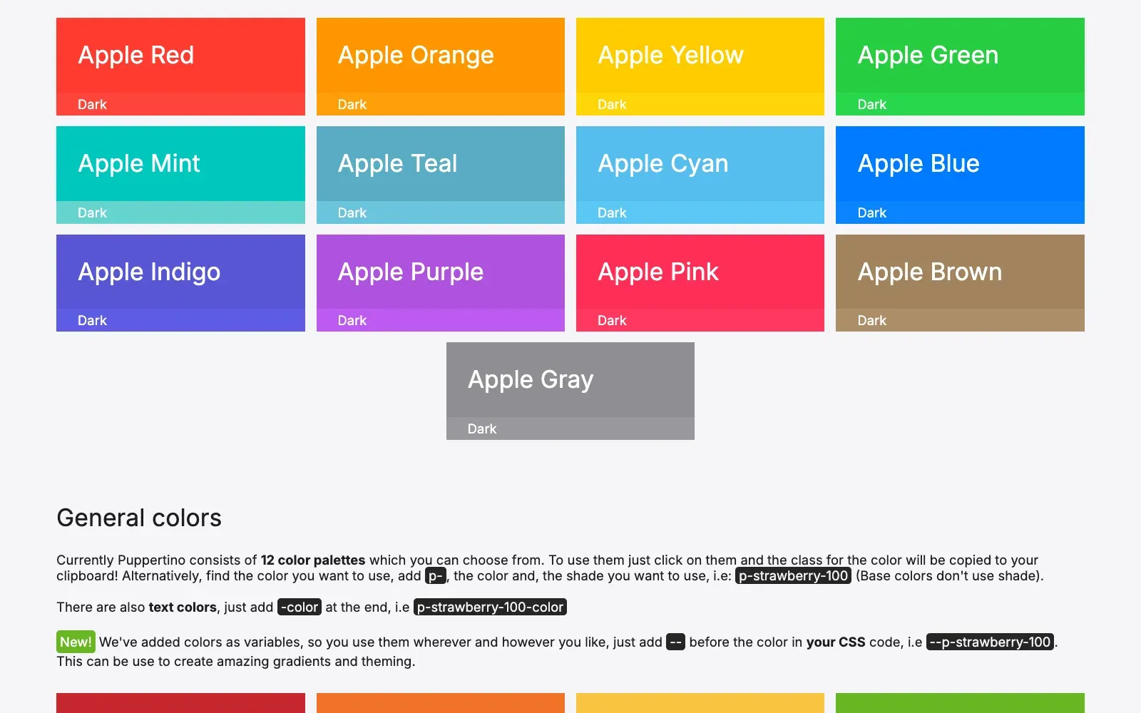
Puppertino is bigger than most people expect. 10 component systems: buttons (push, icon, action variants), modals, forms and inputs (the largest at over 500 lines of CSS), tabs with desktop and mobile variants, segmented controls, action sheets, cards, layout utilities, a complete Apple color palette with 916 lines of official colors, and a shadows and blur system. 7 JavaScript modules handle interactivity. Zero external dependencies.
The forms system uses native HTML5 validation states, :invalid, :valid, :placeholder-shown, instead of custom JavaScript validation. Custom checkboxes and radios use gradient backgrounds with layered box shadows to nail the macOS look. The select dropdowns replace the browser’s native arrow with an inline SVG data URI, so there’s no external requests, no icon font. The modal animations use a custom cubic bezier curve rather than standard easing, and they respect prefers-reduced-motion for users who’ve disabled animations. All interactive components use aria-hidden where appropriate, and focus states are thick 3px outlines at proper contrast, not thin rings that disappear on some backgrounds.
Accessibility
This wasn’t something I added later. The forms got a dedicated accessibility pass: 3px focus outlines with high contrast, proper ARIA support on action sheets and modals, @supports fallbacks for features like backdrop-filter, and reduced motion support for every animated component. Focus management follows the macOS pattern, visible and clear without being intrusive. If the browser doesn’t support backdrop blur, the component falls back gracefully instead of breaking. That December 2024 commit alone touched 26 files, 788 lines changed, all focused on making the framework more accessible.
Six Years of Maintenance
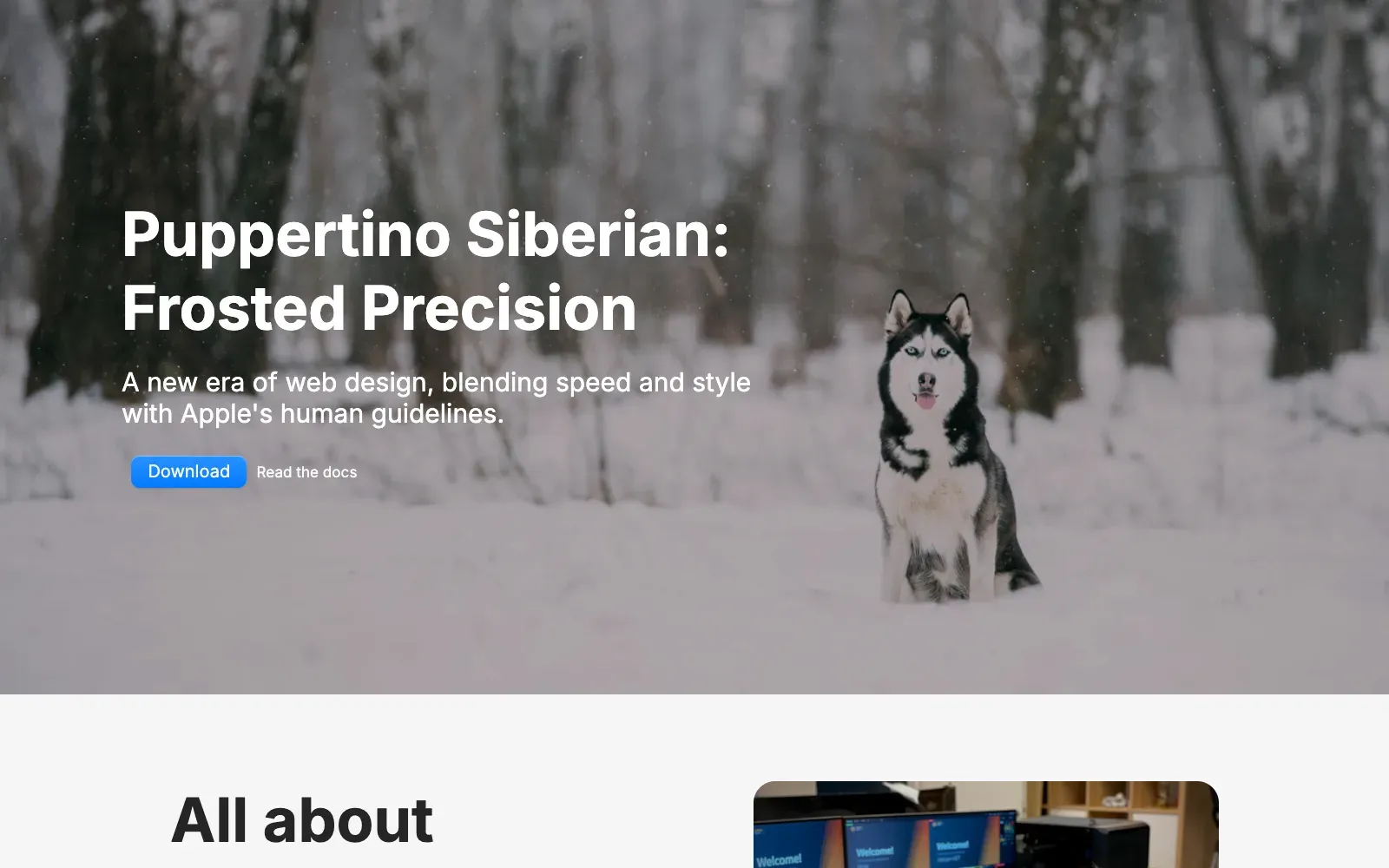
I started Puppertino in 2019 and I’m still actively maintaining it. That’s six years. Named releases like “Siberian” in October 2024 brought a full overhaul: form improvements, the entire Apple color palette redesigned, shadow system reworked, documentation rewritten. Published to npm as @codedgar/puppertino with CDN distribution through jsDelivr. The package.json even marks CSS and JS files as side effects so bundlers don’t accidentally tree-shake them out.
Seven contributors have submitted PRs over the years. The contributing guidelines are pretty direct: “Changes that don’t provide value will not be accepted.” I’ve reviewed and merged PRs for tabs, actions, npm cleanup, and code formatting, but the core vision stayed mine. Knowing when to accept a contribution and when to say no is honestly one of the harder parts of open source.
Community Impact
- 5,000+ downloads across npm and direct installs
- 1,000+ GitHub stars from developers worldwide
- Published on npm with granular component imports
- Used in production applications across different industries
Having a platform that is used by over 5,000 developers, it’s pretty cool. That part still feels good.
What I Took From This
The opinionated approach worked because it attracted people who wanted macOS styling. The docs site became just as important as the framework itself, which taught me a lot about how people actually adopt tools. Zero dependencies was a conscious choice. No React, no build tools required, just CSS and vanilla JS. In 2025 that’s almost a statement in itself.
Open source also taught me how to ship and, honestly, how to say no. Balancing feature requests, bug fixes, and the original vision is hard. The community feedback shaped where the project went, but I had to keep a clear picture of what Puppertino was supposed to be. Six years later, I’m still maintaining it, still shipping updates, and the framework is more complete than it’s ever been. That kind of longevity doesn’t happen by accident. You have to care about the thing you built.
What comes next
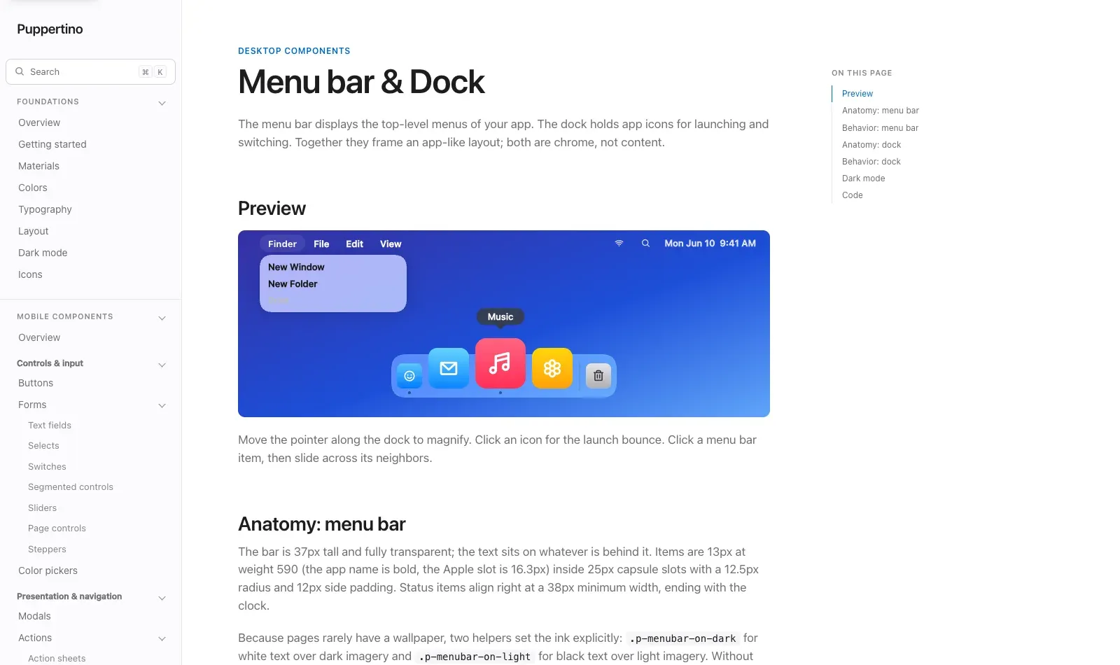
There’s a version 2.0 I’ve been working on for a while now. This time I’m building against Apple’s macOS 26 specification instead of my own approximations from 2019, which meant going back to the foundations first. Colors, typography, and materials, all rebuilt from the real values. Everything from version 1 still works, so upgrading is just a dependency bump.
The component set got a lot bigger too. Menu bars, docks, sheets, popovers, date pickers, sliders. And now components are grouped by mobile and desktop. New documentation as well, where every component has a live preview and markup you can copy straight out.
As always, like every Codedgar project, new version coming soon™️
Working on something similar?
I'd love to hear what you're building. For me, the best projects start with a good conversation, so feel free to reach out.
Let's Talk