pearOS
Design, Copy & Frontend
I was in that Discord for years before I got to build their site
How I got in
I’d been following pearOS for a long time before I had anything to do with it. Part of it is that we’re doing similar things from different sides. Alexandru Balan builds a Linux distro that feels like a Mac, and I’ve spent years building a framework that makes the web feel like Apple made it. Same gap, different tools. So I was in the Discord, watching it grow, watching every release.
Then the Discord got hacked. Almost everything was wiped, and Alex spent a while clawing back whatever could be restored. Watching that happen is what made me finally say something. I sent him a message: I’ve been following this for a while, I’m a frontend developer, and if you want, I can get you a new site. He was thrilled. He said let me know whenever you want to collab, and that was that.
The moment came later, when he shipped Liquid Gel. It’s his take on liquid glass, running on Linux, and it’s genuinely impressive. That felt like the right thing to build a page around, so I told him I’d do it and he’d get a page he actually likes. We started talking, and a few weeks later the site was live.
What I did
All of it. The design, the sections, the order things appear in, the copy, the build. Alex reviewed most of it as it came together and he owns everything about the operating system itself. The website was mine.
The actual hard part
It wasn’t technical. The site is simple by design, and the liquid gel shader worked the way I wanted it to almost immediately.
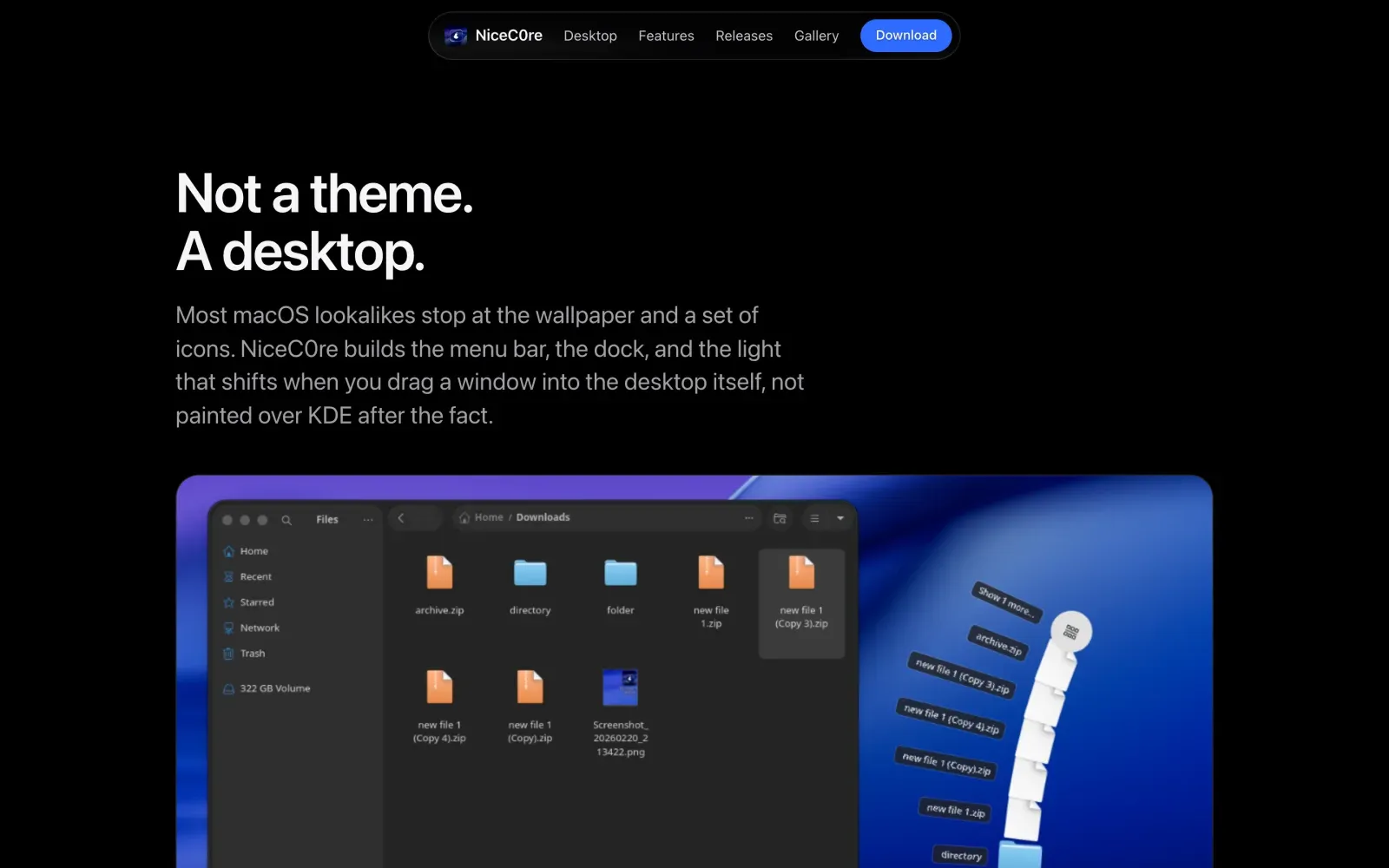
The hard part was the audience. pearOS sits between two groups of people who don’t usually want the same things. Linux users care about control, about the package manager, about what’s under the hood. People coming from a Mac care about how it looks and whether they’ll have to open a terminal. Write for one and you lose the other.
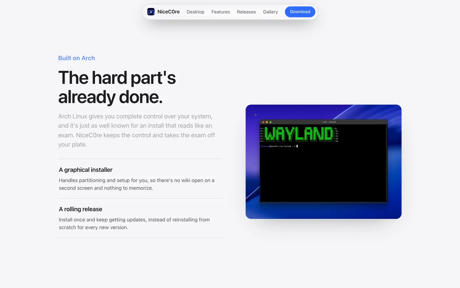
So the page alternates. The desktop and the material get the visual sections, big and quiet and mostly image. Arch, the installer, the rolling release, the AUR, those get the plain sections that explain themselves in one line each. Nobody has to read the half that isn’t for them, and nobody feels talked down to.
Showing a material you can’t screenshot
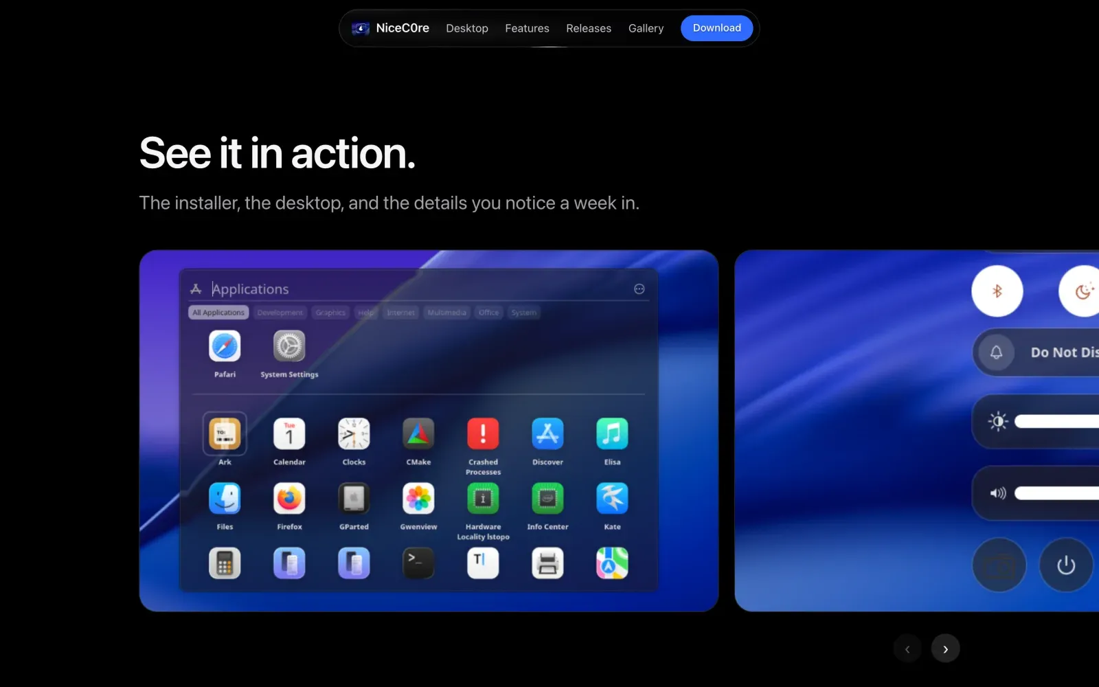
Liquid Gel is the thing that makes pearOS look like pearOS, and it’s the thing a screenshot is worst at. We had captures of the desktop, but you can’t zoom into a screenshot to show how light bends through a window. The resolution isn’t there, and we didn’t have the setup Apple uses to film their own materials moving.
So we didn’t show it. We built it.
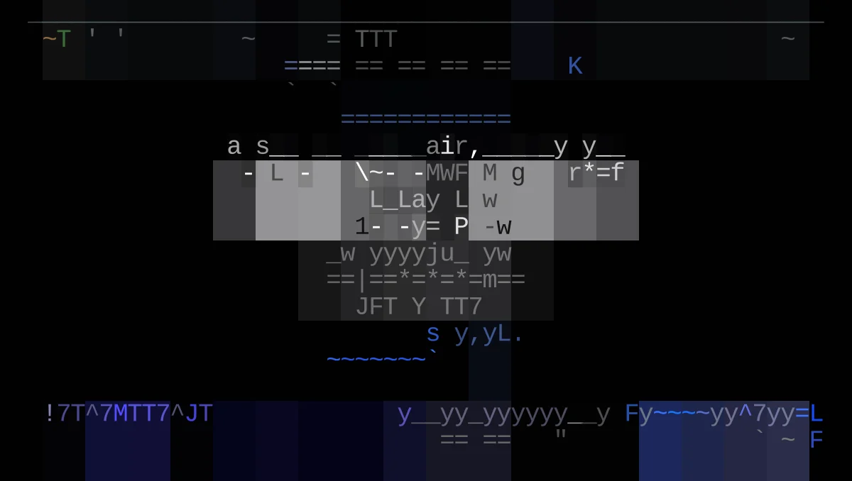
The section is the material itself, rendered live in the browser. Nine pieces of glass float on a light background, each one drifting toward the pointer at its own weight, the heavy ones lagging behind the quick ones. They merge into each other when they get close. The key light swings overhead as the section comes into view and underlights everything by the time it leaves, so the glass never looks like a static image.
Then the part I didn’t expect to work. The navigation bar is also liquid glass, and it floats above everything. When it passes over the gel section, it refracts the glass underneath it. Straight lines bend as they cross behind the pill. The shadows shift as you scroll. Two separate pieces of glass, one on top of the other, both reacting.
I genuinely didn’t know we could do that. It’s the difference between a page that says the material bends light and a page where you watch it happen.
Someone else’s brand
This was the first time I ran a brand that wasn’t mine and wasn’t a client’s in the usual sense. pearOS has a look, and it borrows from a company everyone recognizes. The risk is obvious: go too far and the site reads like a knockoff, which is the fastest way to make a real project look unserious.
What I kept was the calm. Lots of space, one idea per section, type doing the work instead of decoration. What I left alone was everything that would have made it a copy. The result feels like it belongs to pearOS, and I’m proud of how close to the line it gets without crossing it.
What it meant
I’d been watching this project for years. Seeing how it evolved, seeing the releases land, seeing it get better. Being part of it, even for a short window, is still a little strange to think about.
We built the page to see if it would pull people over from macOS, and it did. Newer versions of pearOS lean into that audience more than they used to, which tells me the page did its job.
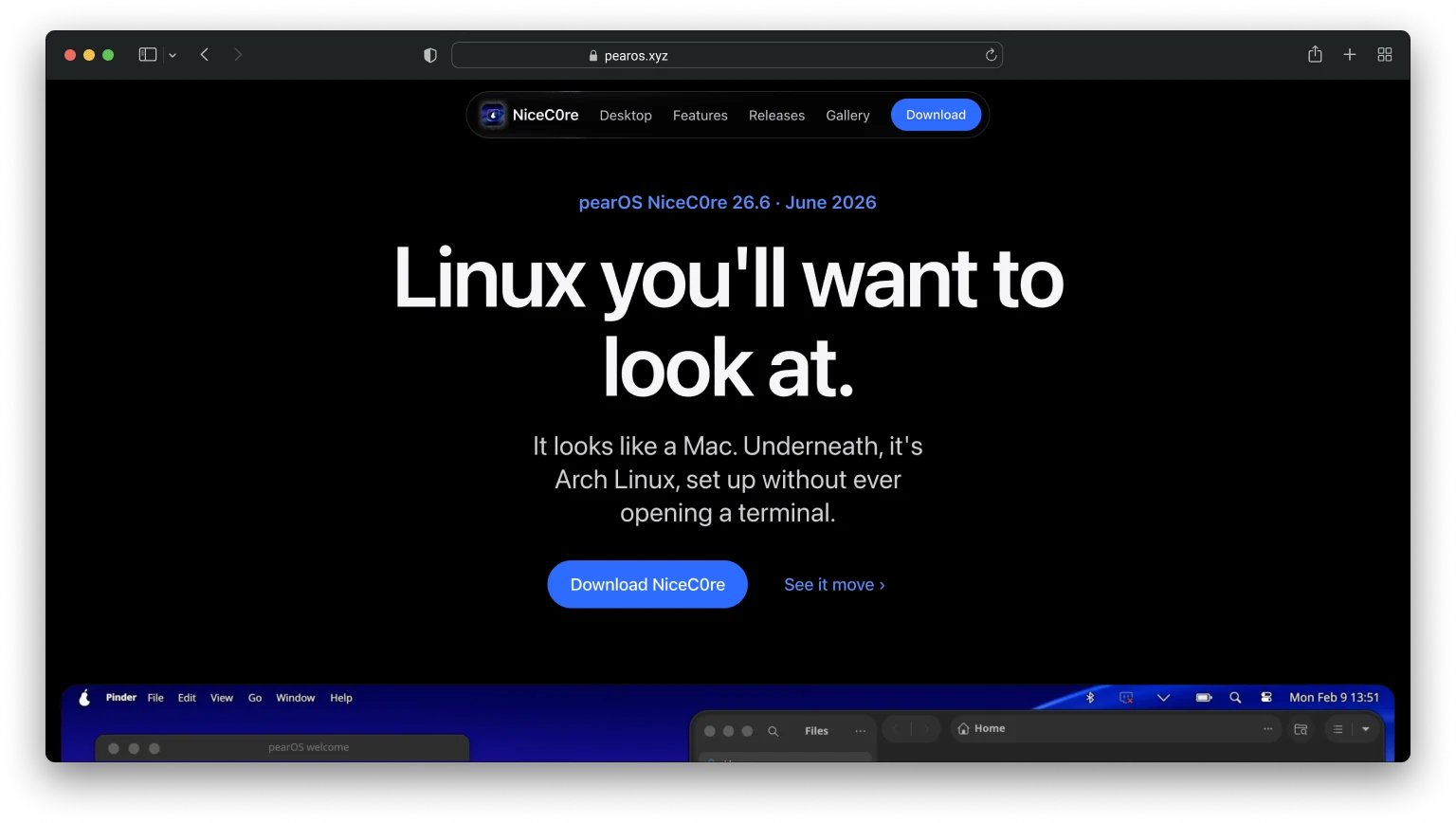
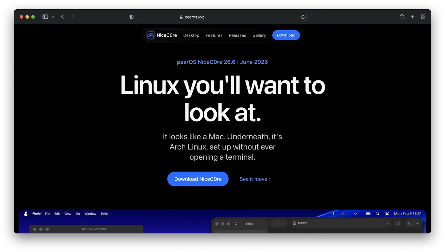
The line I wrote for the hero was “Linux you’ll want to look at.” That’s the project’s tagline now. The whole audience problem I’d been chewing on for weeks ended up compressed into six words, and it’s how pearOS has introduced itself ever since the new page went up.
But the part I keep coming back to is smaller than that. Alex trusted me with how his project introduces itself, and he liked what came back. That’s a good feeling.
Working on something similar?
I'd love to hear what you're building. For me, the best projects start with a good conversation, so feel free to reach out.
Let's Talk