MapVX App
Frontend Tech Lead
Scaled into tech lead, then led the team to fix the debt we all built together

What MapVX Is
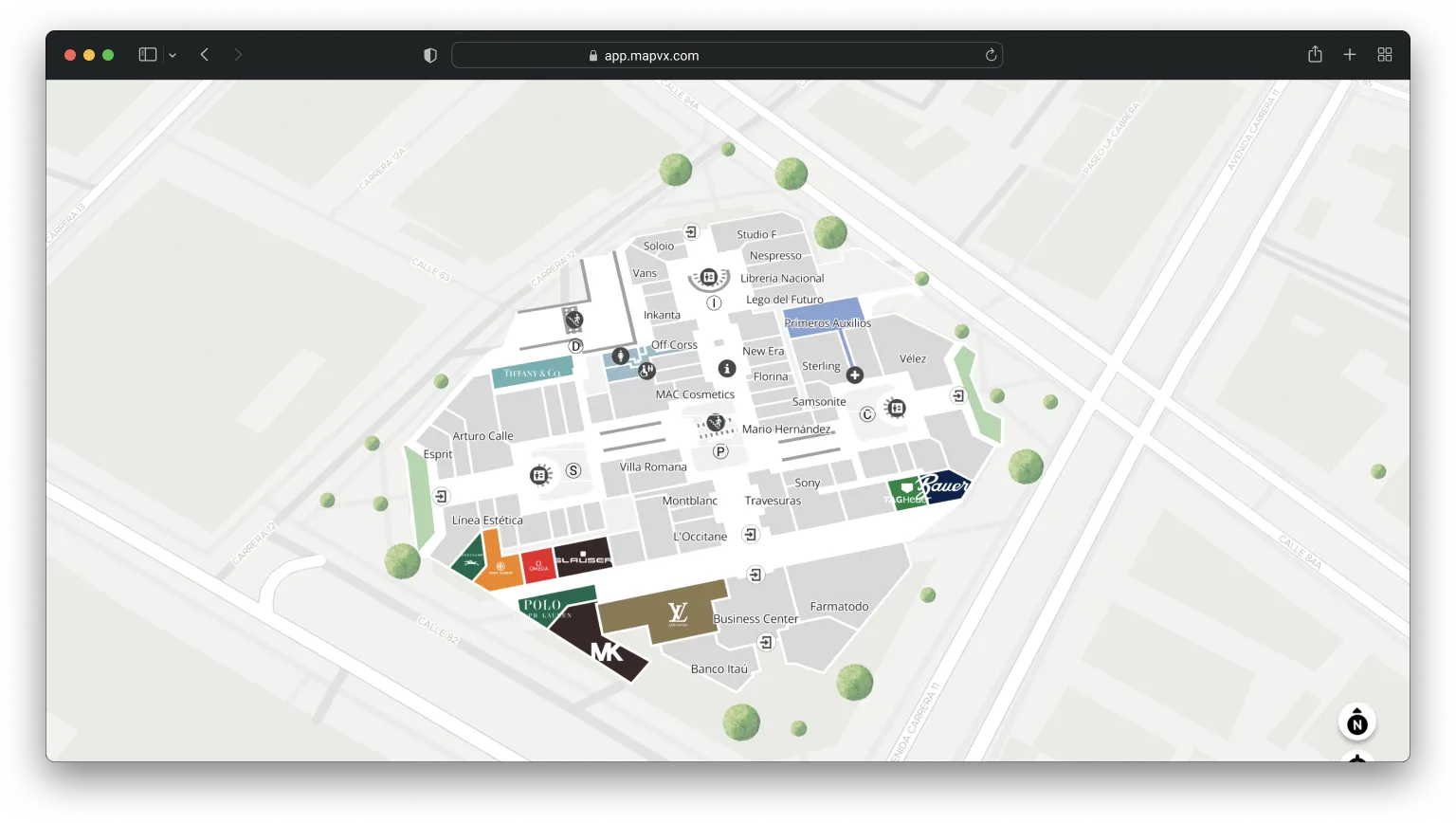
MapVX is an indoor navigation platform. Think Google Maps, but for the inside of buildings. Malls, hospitals, universities, shopping centers. Users open it, see an interactive map of the venue, search for stores or services, and get turn-by-turn directions to walk there. It supports accessible routing, QR code scanning for quick navigation, floor switching for multi-level buildings, and real-time GPS positioning indoors.
The app serves over 70 venues across Latin America, the United States, Argentina, Mexico, and other international markets, each one with its own branding, configuration, and deployment. I joined as a developer, helped build the product, and then scaled into the tech lead role where the structural issues became pretty clear to me because I had lived with them.
The Challenge
Technical debt that we all accumulated together, inconsistent styling across the board, and performance problems that were hurting the user experience. The team was growing, but new engineers were taking months before they could actually be productive. We were dealing with CSS conflicts all the time. Different engineers naming things differently, specificity getting messy, stuff like that. There was no shared language between design and engineering.
On top of that, every new client meant a custom deployment. We had environments for malls, healthcare networks, shopping centers, all over. Each one needed its own look, its own colors, sometimes its own layout tweaks. And we were doing all of that manually, which didn’t scale.
How I Approached It
Picking BEM for the CSS architecture
We had CSS conflicts constantly. I looked at CSS Modules, which would’ve meant changing the build tooling. I considered CSS-in-JS, but the team wasn’t familiar with it and I had performance concerns. I went with BEM because it required zero tooling changes, had a shallow learning curve, and solved the naming collision problem right away. The class names are verbose, for sure. But predictability was worth the extra characters.
Building a white-label theming system
This is probably the decision I’m most proud of on this project. We needed a component library, but design kept changing colors and spacing mid-sprint. And every new client needed their own branding. So instead of just creating a few variables, I built a full theming system from scratch.
50+ semantic tokens organized by purpose: text colors, backgrounds, borders, border-radius, shadows, indicators. Every single component references tokens, never hardcoded values. I overwrote the framework’s default variables to integrate with our token system, so everything stayed consistent whether it was a custom component or something from the library.
Then I added dark mode support. One class toggle and the entire app switches themes. And I built a client-specific variant system on top of that, so a venue could get zero-radius corners, different accent colors, whatever they needed. All through configuration, no code changes.
That slowed down initial component development by about a week. But after that, onboarding a new client’s branding became trivial. Update a few tokens, deploy, done. I also wrote documentation inside the stylesheet itself explaining naming conventions and how to create new themes, because I knew I wouldn’t be the only person maintaining this.
Migrating incrementally instead of rewriting
Leadership wanted the new architecture deployed quickly, and a full rewrite would have taken months. I pushed for incremental migration. New features used the new architecture, and we migrated old features when it made sense, prioritized by business value. For about 3 months we had two architectural patterns living side by side, which wasn’t ideal. But we shipped features continuously instead of going dark for a rewrite, and I feel like that was the right call.
Things I Built Directly
The place modal
The app’s core interaction is tapping on a place and seeing its details. I built that entire modal from scratch with full gesture support: swipe to dismiss, swipe to collapse, touch interactions you’d expect from a native app but running entirely in the browser. It adapts between mobile and desktop with different layouts for each, and handles multiple content types depending on what place you’re looking at.
Virtual scroll for the carousel
The main screen shows a horizontal carousel of all the places in a venue. Some malls have hundreds of stores. The original implementation rendered every single card at once, which got slow fast. I replaced it with a virtual scroll system that only renders what’s visible, plus a buffer. I also wrote custom scroll behavior for desktop since the native browser snap doesn’t work well with mouse dragging. Mobile kept the native approach since it handles touch just fine.
External positioning system
Some clients embed the map inside their own apps or websites. They needed a way to communicate the user’s position to our app without relying on GPS. I built a system that lets partner platforms pass location data into the app so it can position the user correctly, figure out which floor they’re on, and adjust the map accordingly. That’s what makes the difference between “we embedded a map” and “we have indoor navigation inside our product.”
Bundle size cleanup
I went through the icon system and found we were importing 18 separate icon packs when we only needed 2. Removed the rest, added a fallback for any icons that might have been missed, and set up a bundle analyzer so we could actually measure the impact of changes like this. Combined with lazy loading and build optimizations, that’s where most of the 90% loading time reduction came from.
The Bigger Picture
43 reusable components in the final system. 70+ client deployments, each with their own environment configuration. I created shared base configurations for client groups like Cencosud so we wouldn’t duplicate settings across their 14+ venues. The app supports 4 languages: English, Spanish, Japanese, and Arabic, with translations managed through an external platform.
I led a 6-person frontend team, setting up code review standards and agile practices that actually worked for us. I presented feature roadmaps to C-level executives, pretty much translating the technical work into terms that made sense for the business.
Some of the smaller things I did on my own initiative: I added a “please rotate your phone” overlay for landscape mode because the map was unusable sideways. I set up connection preloading for the six external services the app relies on, which shaved off noticeable load time. I fixed an edge case where place details wouldn’t show up correctly when the data came back in Spanish instead of English. Little things that make the difference between an app that works and one that works well.
What I Took From This
The theming system and BEM together made every feature after that faster to build. Each decision was a component of a bigger machine, and once the gears were in place, things moved. Shipping incrementally kept everyone happy while we improved the foundation underneath. The documentation we wrote for the component library cut onboarding time from months to weeks, which for me was one of the biggest wins.
Working on a product that serves 70+ real venues taught me something about scale that you don’t get from smaller projects. Every decision you make gets multiplied. A bad default affects every client. A good abstraction saves hundreds of hours across deployments. At the end of the day, the technical decisions only matter if the people around you understand why you made them, and if the system keeps working long after you’ve moved on to the next thing.
Working on something similar?
I'd love to hear what you're building. For me, the best projects start with a good conversation, so feel free to reach out.
Let's Talk